An introduction to network meta-analysis using the viscomp package
Georgios Seitidis
Source:vignettes/viscomp.Rmd
viscomp.RmdWhen multi-component (complex) interventions are present in a network meta-analysis model we usually interested on:
- identifying the most efficacious components
- identifying which component combination works better
- understanding the behavior of the components
The viscomp package provides several visualization tools to address these issues. This document makes an introduction to viscomp’s set of tools and presents how to apply them on network meta-analysis when multi-component (complex) interventions are included.
Single outcome
Artificial network meta-analysis model
Load the MACE data of the viscomp package
Network meta-analysis (NMA) model is applied using the R-package
netmeta. MACE is a dichotomous harmful outcome and the NMA
model is constructed using the odds ratios (OR) as effect size.
library(netmeta)
data_NMA <- pairwise(studlab = Study,
                      treat = list(treat1, treat2, treat3, treat4),
                      n = list(n1, n2, n3, n4),
                      event = list(event1, event2, event3, event4),
                      data = MACE,
                      sm = "OR" )

net <- netmeta(TE = TE,
               seTE = seTE,
               studlab = studlab,
               treat1 = treat1,
               treat2 = treat2,
               data = data_NMA,
               small.values = "good",
               ref = "UC")
Descriptive analysis of components with compdesc
compdesc performs a descriptive analysis for the
components observed in the network. It provides 3 items as an
output.
Item crosstable contains a cross-table with the
frequency of the components. Diagonal elements refer to the components,
while off-diagonal elements to the components combinations. Each cell
represents the number of arms where the corresponding component
(combination) was observed.
Item heatmat visualizes the item crosstable.
Diagonal elements refer to the components and in parentheses the
proportion of study arms including that component is provided, while
off-diagonal elements to the frequency of component’s combinations and
in parentheses the proportion of study arms with both components out of
those study arms that have the component in the row is provided. Also,
the intensity of the color is proportional to the relative frequency of
the component combination.
Item frequency provides useful descriptive
characteristics about the component’s frequency. In addition, it
reports:
- the number of arms where the component was observed (column Frequency)
- the number of studies in which the corresponding component was included in all arms (column A)
- the percentage of studies in which the corresponding component was included in all arms (column A_percent)
- the number of studies in which the corresponding component was included in at least one arm (column B)
- the percentage of studies in which the corresponding component was included in at least one arm (column B_percent)
- the number of studies in which the corresponding component was not included in any arm (column C)
- the percentage of studies in which the corresponding component was not included in any arm (column C_percent)
- the ratio of columns A and B (column A.B).
We can perform a descriptive analysis of the components with:
compdesc(net)
#> $crosstable
#>     A  B  C  D G E UC
#> A  17  9  9  5 0 2  0
#> B   9 18  7  5 1 2  0
#> C   9  7 15  4 0 1  0
#> D   5  5  4 11 0 0  0
#> G   0  1  0  0 1 0  0
#> E   2  2  1  0 0 3  0
#> UC  0  0  0  0 0 0 15
#>
#> $frequency
#>    Component Frequency A  A_percent  B  B_percent  C C_percent       A.B
#> A          A        17 2 0.09090909 11 0.50000000 11 0.5000000 0.1818182
#> B          B        18 3 0.13636364 13 0.59090909  9 0.4090909 0.2307692
#> C          C        15 2 0.09090909 11 0.50000000 11 0.5000000 0.1818182
#> D          D        11 1 0.04545455  9 0.40909091 13 0.5909091 0.1111111
#> G          G         1 0 0.00000000  1 0.04545455 21 0.9545455 0.0000000
#> E          E         3 0 0.00000000  3 0.13636364 19 0.8636364 0.0000000
#> UC        UC        15 0 0.00000000 15 0.68181818  7 0.3181818 0.0000000
#>
#> $heatmat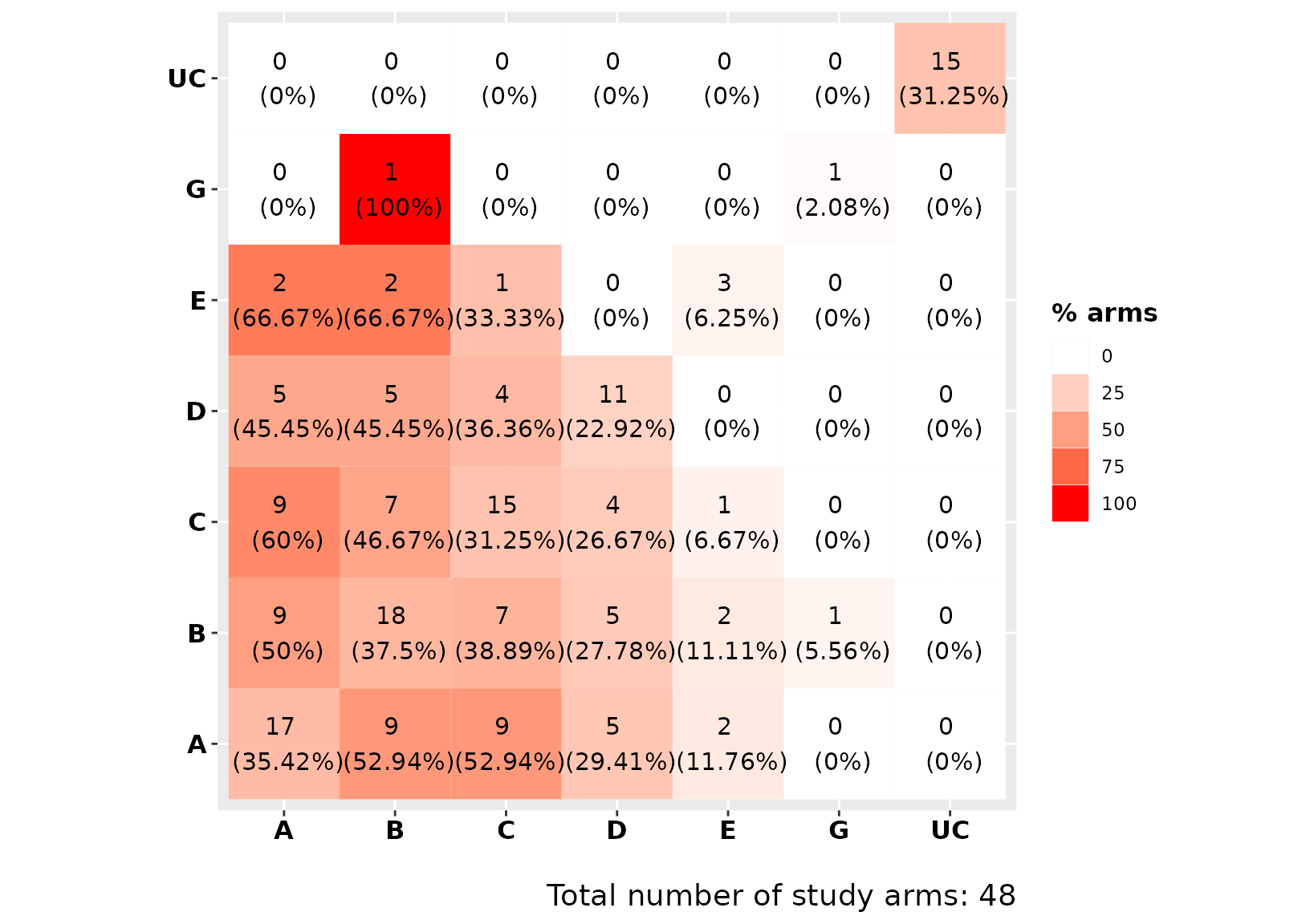
Explore components geometry with compGraph()
compGraph() is meant to visualize the frequency of
components’ combinations found in the network. The function resembles a
network plot where nodes represent the individual components found in
the network, while edges represent the combination of components found
in at least one treatment arm of the trials included in the NMA model.
Each edge’s color represents one of the unique interventions
(components’ combination) found in the network of interventions. Edges’
thickness indicates the frequency by which each intervention
(combination of components) was observed in the network (number of arms
in which the combination was assigned). The number of the most frequent
combinations can be modified from the argument mostF.
We can visualize the 10 most frequent component combinations with:
compGraph(net, mostF = 10, title = "")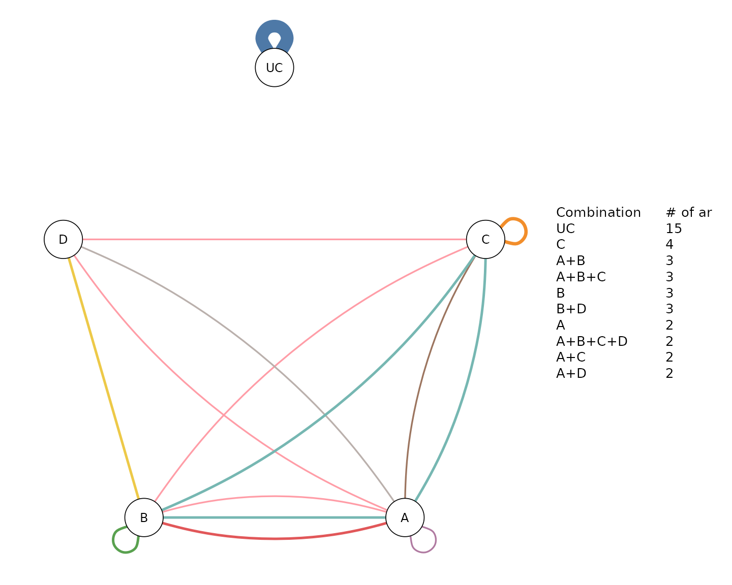
In NMA we usually have interventions that are used as a potentially
inactive reference intervention (e.g. placebo, usual care), and are not
combined with other interventions. We can exclude these interventions
through the argument excl. For example, we can exclude the
usual care (UC) from the component network plot with:
compGraph(net, mostF = 10, title = "", excl = "UC")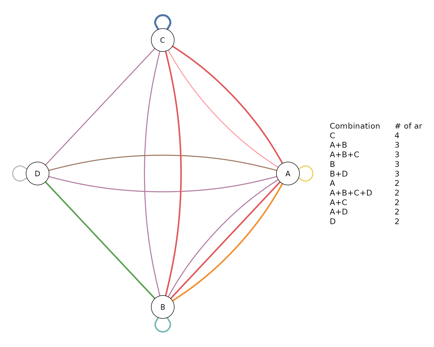
Explore the efficacy of the two-by-two components combinations with
heatcomp()
heatcomp() creates a heat plot comparing the two-by-two
component combinations to the reference intervention. Diagonal elements
refer to components, while off-diagonal to components’ combinations.
Each element summarizes the efficacy of the interventions (obtained from
the NMA model) that includes the corresponding component combination.
The frequency of the components combinations found in the NMA model is
printed by default (freq = TRUE). Combinations that were
not observed in the NMA model are denoted by the letter “X”. The
function by default uses the relative effects and the median as a
summary measure (median = TRUE). The uncertainty around the
NMA estimates is reflected by the size of the grey boxes. The bigger the
box, the more precise the estimate. Moreover, the magnitude of the
evidence is reflected by the color’s intensity. Dark green or red colors
indicate a large impact on the outcome. Outcomes nature (beneficial or
harmful) is defined in the netmeta model (argument
small.values).
The function can be also adjusted to include z-scores by setting the
argument z_value = TRUE. Z-scores quantify the strength of
statistical evidence. Thus, dark green (or red) indicates strong
statistical evidence that the corresponding component (or combination of
components) performs better (or worse) than the reference
intervention.
We can visualize the efficacy of the components, with:
heatcomp(net)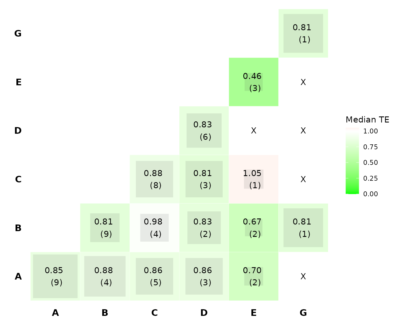
From the plot we see that the most intensive colors are observed for
the component E, B, G, and the combination between components B and G.
Thus, these combination seems to be the most efficacious according to
the heatcomp(). We also see that the frequency of
components B, G and the combination of B and G equals one, indicating
that their corresponding estimates have been obtained by the same single
intervention. Note also that the size for the majority of the grey boxes
is large, indicating that the corresponding NMA estimates are
precise.
Explore the efficacy of the components with
specc()
Components
specc() works similarly to heatcomp()
except that instead of visualizing the two-by-two component
combinations, it can visualize combinations with more than two
components. The function by default produces violin plots based on the
components’ relative effects (z_value = FALSE).
We can visualize the distribution of each component in the network with:
specc(net)
#> Warning: Violin plot requires at least 2 data point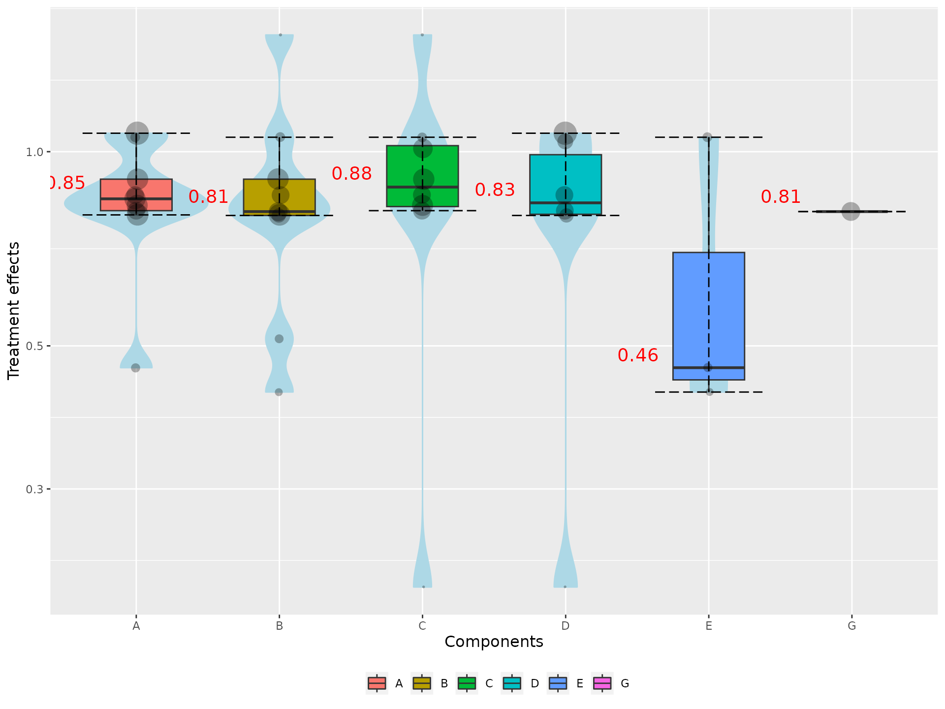
Note that in the plot the median estimates of the components are
equal with the diagonal elements of the heatcomp()
function. Moreover, the size of the dots is proportional to precision of
the NMA estimates. Larger dots denote more precise estimates.
Note also that we receive a warning message because component G was included in a single intervention.
Components combinations
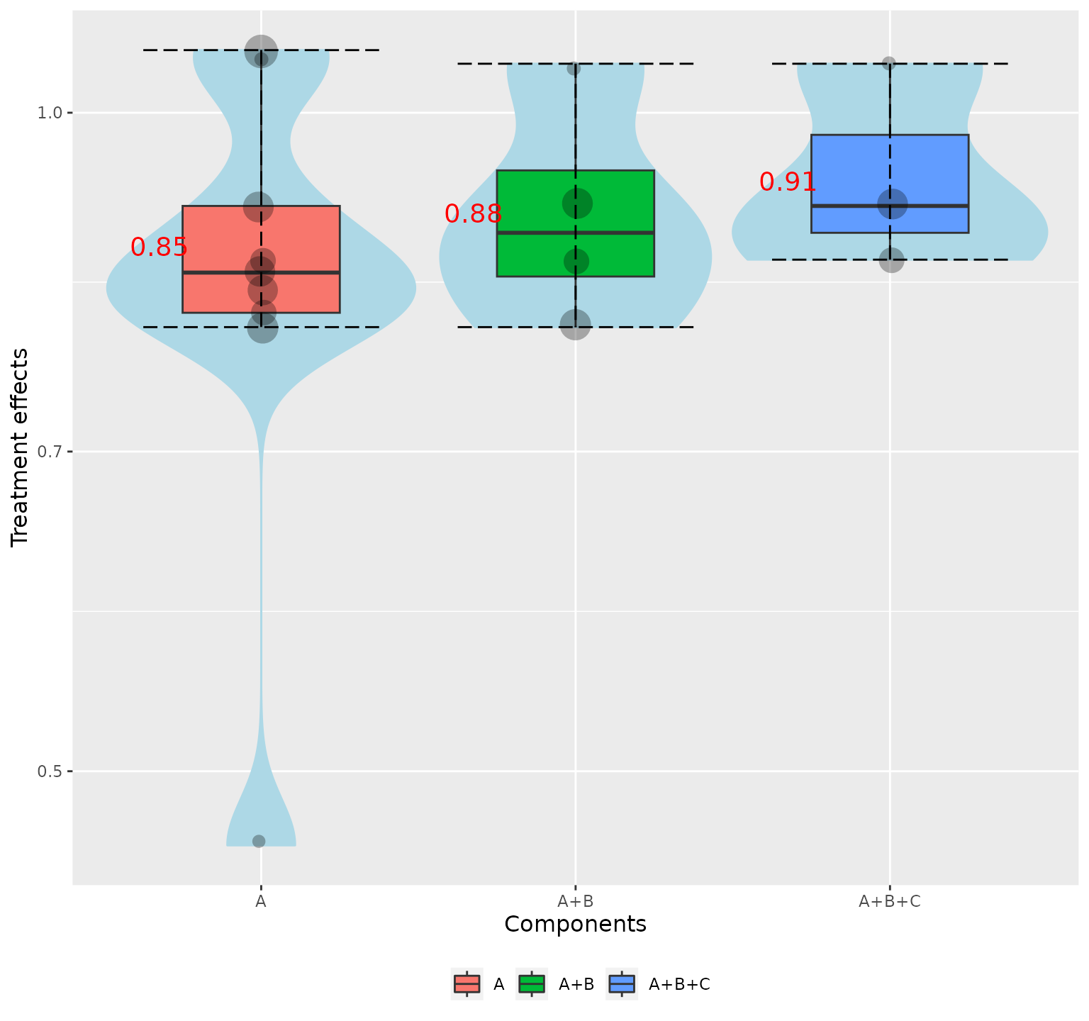
We can visualize the distribution of component combinations (e.g. A, A+B, A+B+C) with:
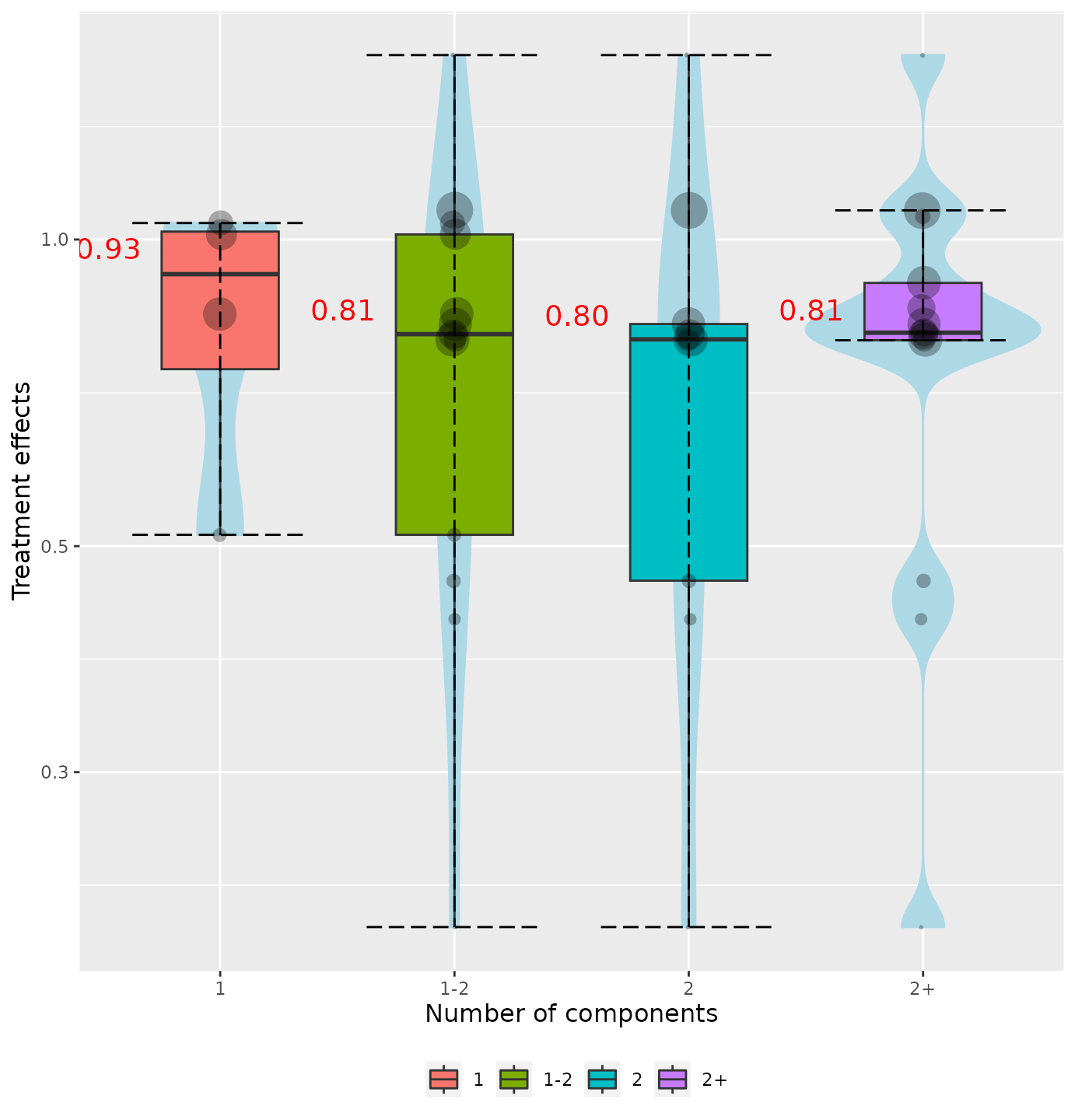
Number of components
Often, we interested on exploring the behavior of intervention’s effect as the number of components increased. We can do that with:
specc(net, components_number = TRUE)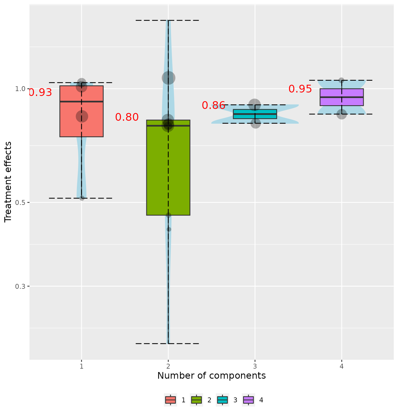
We can also group the violins in clusters based on the number of components. For example, we can create violins for the interventions that includes 1 component, 2 components, 1-2 components and more than 2 components, with:
Explore the efficacy of the components with
denscomp()
The efficacy of a component (or component combination) can be
explored by comparing the corresponding densities.
denscomp() compares the following densities: one density is
constructed by the NMA results referring to the interventions including
the component (combination) of interest, while the second density refers
to the interventions, not including the underlying component
(combination). The function by default uses the NMA relative effects,
but it can be also adjusted to use z-scores by setting the argument
z_value = TRUE.
For example, if we interested on exploring the efficacy of the component combination A+B, we can visualize the densities of the NMA relative effect estimates from the interventions that include and not include components A+B, respectively, with:
denscomp(net, combination = "A+B")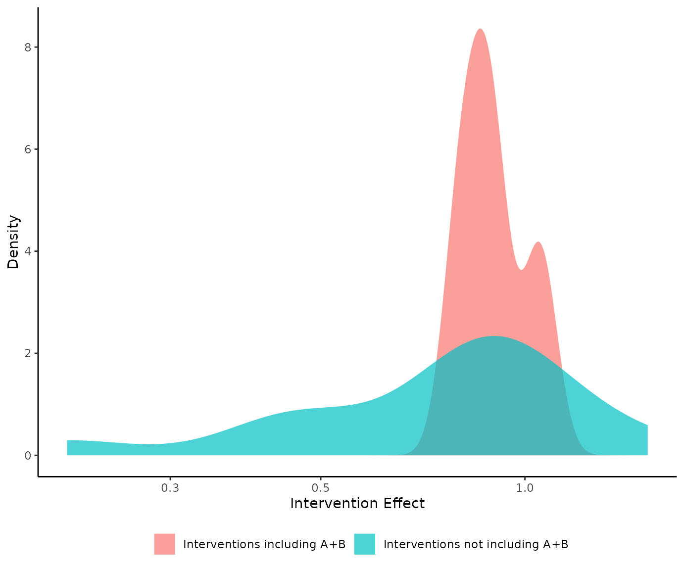
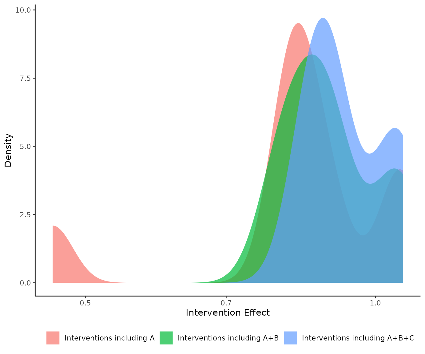
denscomp() can also compare more than two densities. If
we interested for example to compare the densities of the interventions
that include component A, components A+B, and components A+B+C, we can
do it with:
Leaving one component out scatter plot with
loccos()
Exploring whether the inclusion or the exclusion of a component
(combination) has a positive or negative impact on the efficacy of an
intervention could be undertaken by looking at the interventions that
differ by this specific component (combination). loccos()
creates a scatter plot where the x-axis represents the NMA relative
effect of the intervention that includes the underlying component
(combination), while the y-axis represents the NMA relative effect of
the intervention that consists of the same components just like the one
in the x-axis with the only difference that it does not include the
component (combination) of interest. A point on the line y = x indicates
that the inclusion/exclusion of the underlying component does not affect
the efficacy of the interventions. Dots above the y = x line for a
beneficial outcome, indicate that the inclusion of a component hampers
the treatment effect while dots below this line signify a component that
increases efficacy. The opposite holds for a harmful outcome.
The function by default uses the NMA relative effects, but it can be
also adjusted to use z-scores by setting the argument
z_value = TRUE.
We can explore the impact of component A, with:
loccos(net, combination = "A", histogram = FALSE)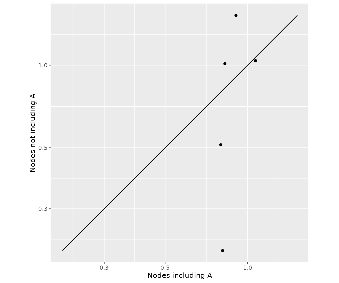
Note that the estimates with or without component A fall below or above the y = x line. This indicates that the additivity assumption might not hold for the Component NMA model. This is because additivity implies that the inclusion/exclusion of a component has the same impact on interventions that differ by this component. This is expressed visually in the scatter plot by a line parallel to y = x.
Waterfall plot with watercomp()
watercomp() works similarly to loccos()
with the sole difference that instead of visualizing the impact of a
component (combination) in a scatter plot, the impact is now visualized
in a waterfall plot. The horizontal y = 0 line represents zero impact on
the intervention efficacy if an extra component is added. Bars indicate
whether the inclusion of the extra component has an impact on the
intervention. The interpretation of the direction of the underlying bars
(positive or negative) depends on the nature of the outcome used
(beneficial or harmful) which is obtained automatically from the
netmeta model.
The function by default uses the NMA relative effects, but it can be
also adjusted to use z-scores by setting the argument
z_value = TRUE.
We can explore the impact of component A, with:
watercomp(net, combination = "A")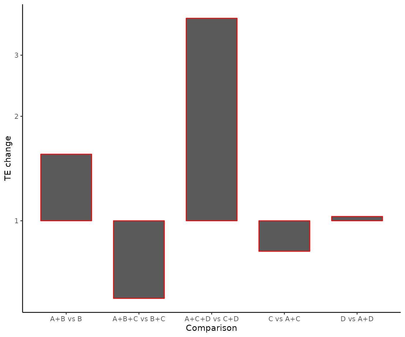
Multiple outcomes
Artificial network meta-analysis model
t1 <- c("A", "B", "C", "A+B", "A+C", "B+C", "A")
t2 <- c("C", "A", "A+C", "B+C", "A", "B", "B+C")

TE1 <- c(2.12, 3.24, 5.65, -0.60, 0.13, 0.66, 3.28)
TE2 <- c(4.69, 2.67, 2.73, -3.41, 1.79, 2.93, 2.51)

seTE1 <- rep(0.1, 7)
seTE2 <- rep(0.2, 7)

study <- paste0("study_", 1:7)

data1 <- data.frame("TE" = TE1,
                    "seTE" = seTE1,
                    "treat1" = t1,
                    "treat2" = t2,
                    "studlab" = study,
                    stringsAsFactors = FALSE)

data2 <- data.frame("TE" = TE2,
                    "seTE" = seTE2,
                    "treat1" = t1,
                    "treat2" = t2,
                    "studlab" = study,
                    stringsAsFactors = FALSE)

net1 <- netmeta(TE = TE,
                seTE = seTE,
                studlab = studlab,
                treat1 = treat1,
                treat2 = treat2,
                data = data1,
                ref = "A")

net2 <- netmeta::netmeta(TE = TE,
                         seTE = seTE,
                         studlab = studlab,
                         treat1 = treat1,
                         treat2 = treat2,
                         data = data2,
                         ref = "A")
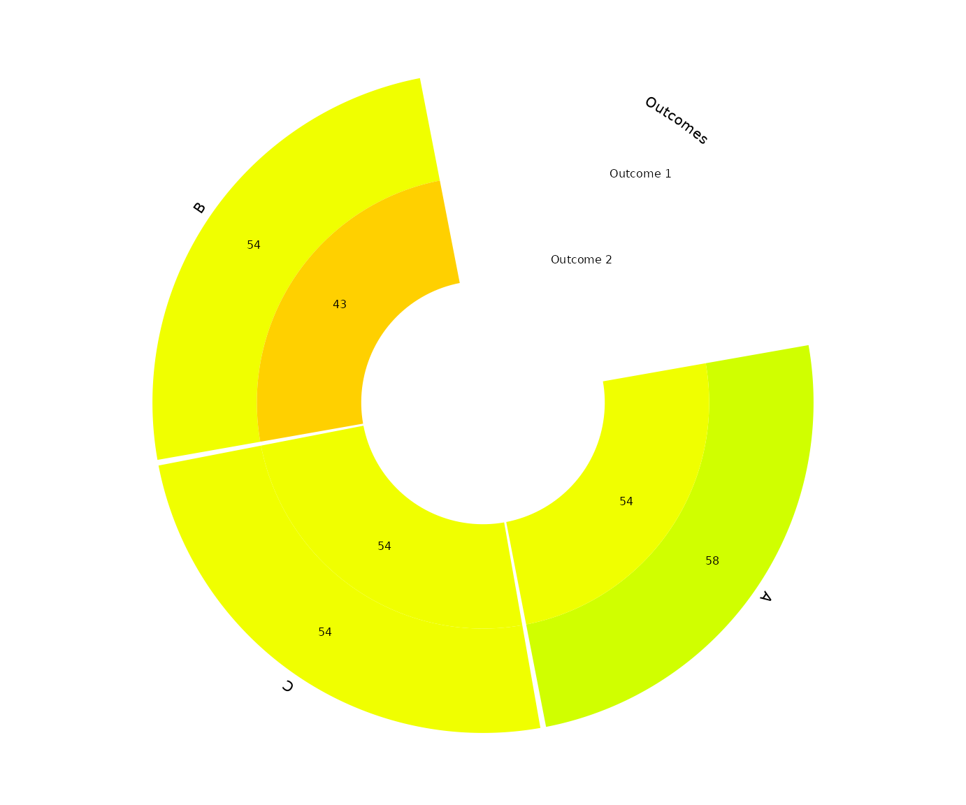
Visualize the components’ ranking for multiple outcomes with
rankheatplot()
rankheatplot() creates a rank heat plot where the
ranking of interventions can be presented across multiple outcomes
(Veroniki et al., 2016). Circles corresponds to outcomes, while rads to
components. Sectors are coloured according to the ranking of the
relevant components within the underlying outcomes. Ranking is
calculated as the median (or the mean) of the intervention P-scores
including the component of interest in the particular outcome. The
coloured scale ranges between red (p-score = 0%) and green (p-score =
100%). Uncolored sectors, if any, suggest that the underlying component
was not included in any of the interventions in the NMA for the
particular outcome.
We can visualize the p-scores for the two outcomes, with:
rankheatplot(list(net1, net2))